Overview:
ABROME is an alternative K-12 "school" in Central Texas.
This was a pop bono project to support the Founder’s vision in establishing an environment where people’s identities and diversity are celebrated. The project, including logo, collateral, and social media ads, helped the school to connect with prospective students and parents.
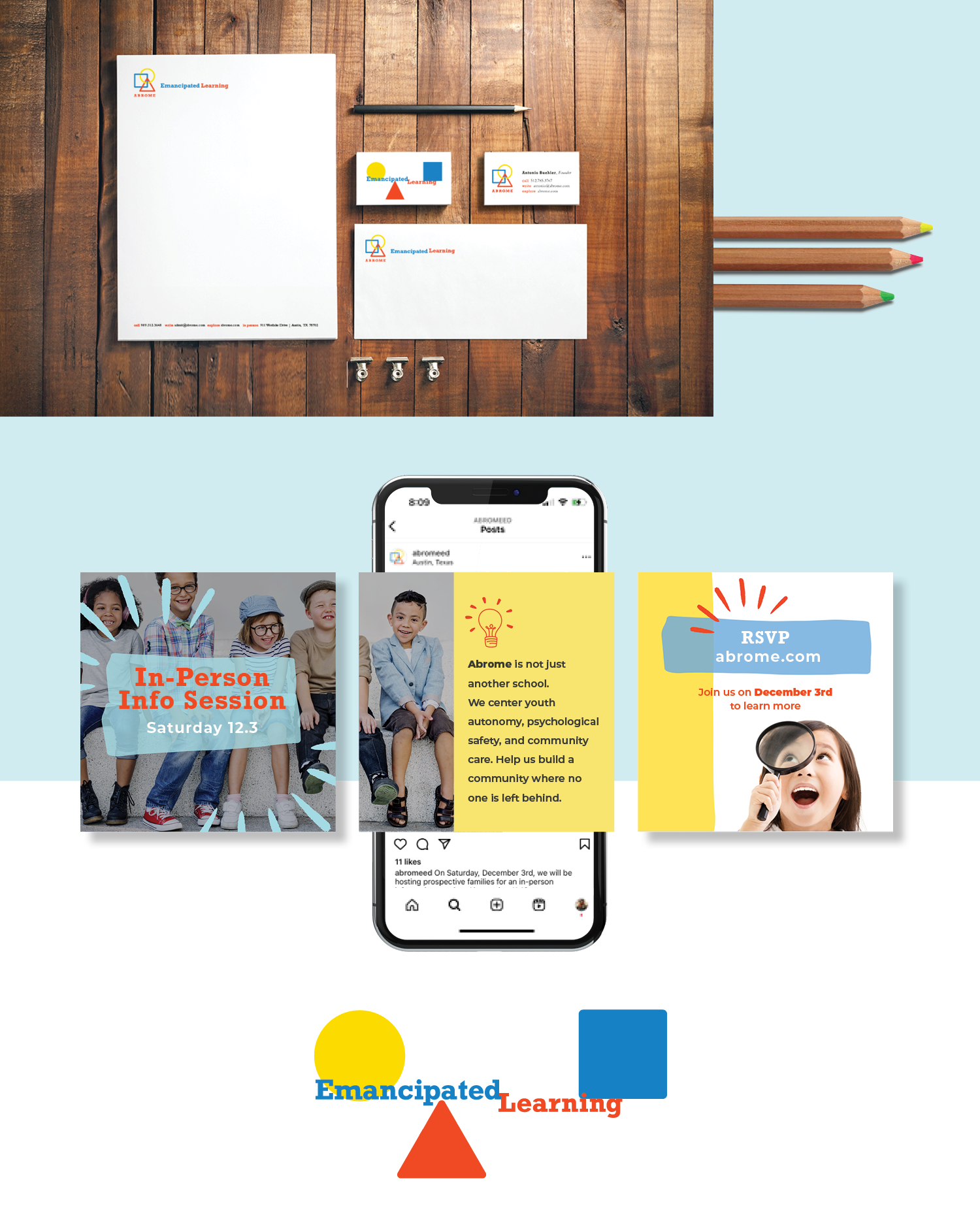
[Visual identity, print, digital]
Abrome

Concept:
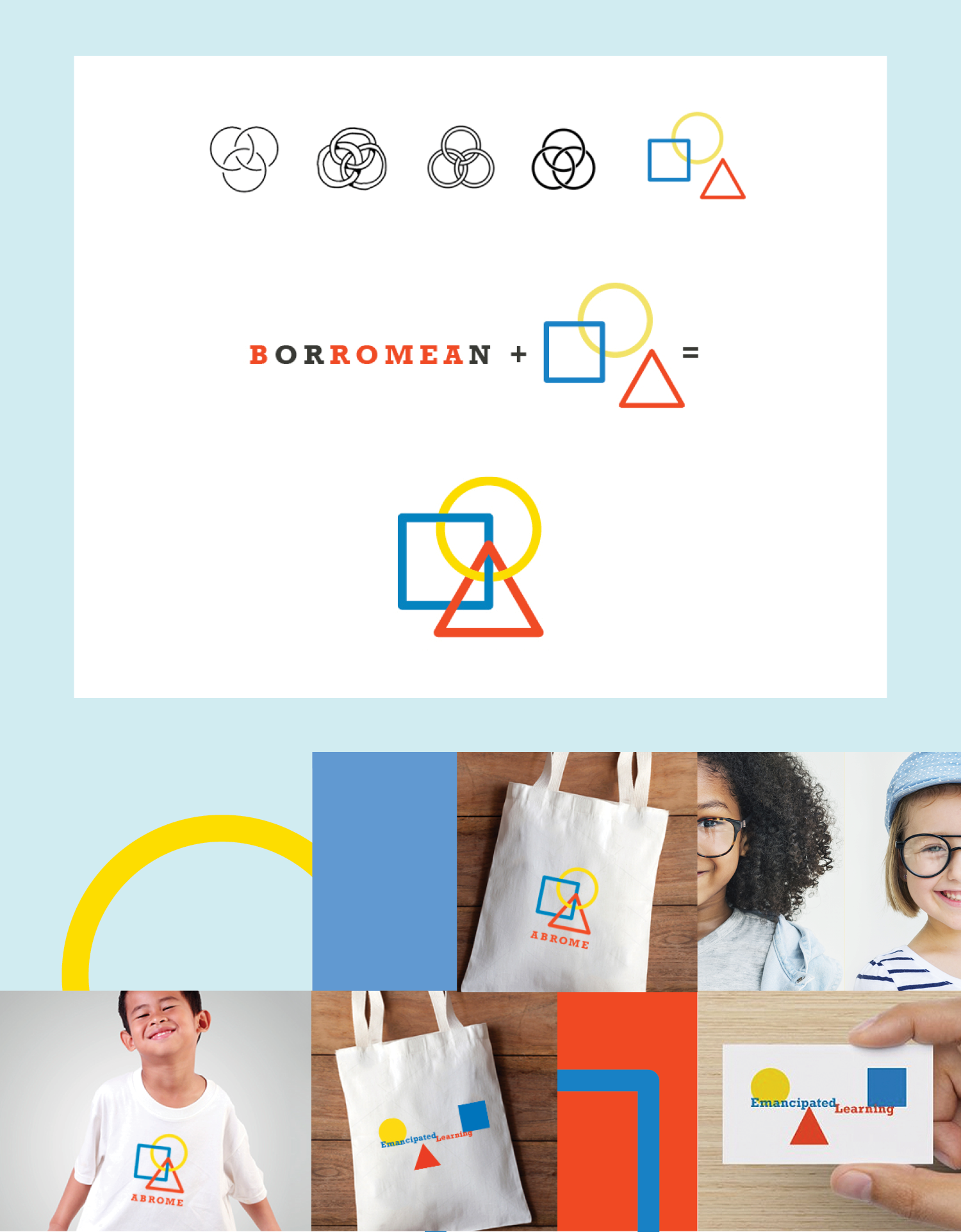
ABROME is consisted of the letters in the word BORROMEAN.
BORROMEAN RINGS are a symmetrical arrangement of three intersecting circles. Removing any ring results in two unlinked rings. In other words, no two of the three rings are linked with each other, but all three are linked. It is a symbol of strength in unity.Instead of 3 rings, the logo has 3 geometric shapes a circle, square, and triangle. These are important building blocks in both geometry and visual language, and used to convey diversity and the foundation of education.